
Getting Italian Text Right in AI Images: Menus, Posters, and Signs
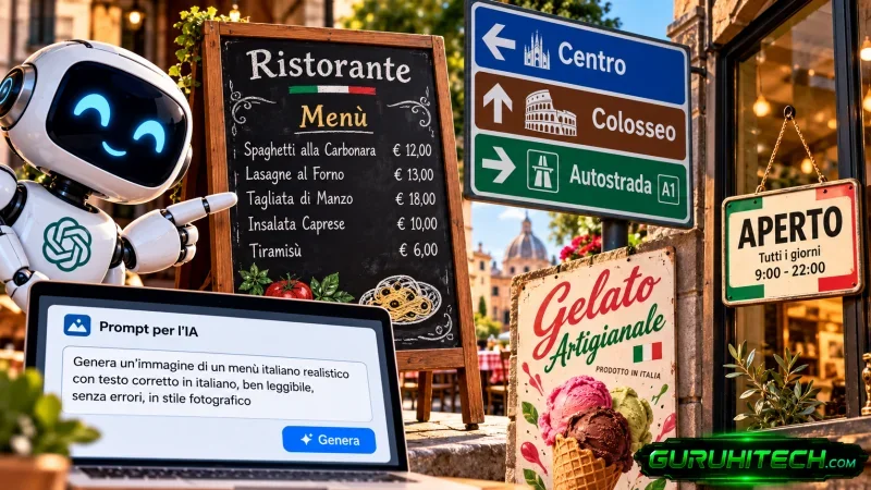
Every Italian creator who tests an image model eventually hits the same wall. You ask for a rustic trattoria sign or a neighborhood festival poster, and the picture itself turns out beautifully: warm lighting, weathered wood grain, soft evening shadows. Then you look closely at the lettering.
Caffè loses its grave accent and becomes caffe, or worse, an unreadable cluster of glyphs. An apostrophe melts into an extra letter. A double consonant disappears, turning tagliatelle into tagliatele.
Rendering clean typography inside an image is already difficult. Rendering Italian — with its accents, its elisions, and its meaning-changing double consonants — exposes every weakness a text encoder has. Most failures follow patterns, though, and patterns can be worked around.
Three Worked Prompts That Actually Render
Whether you work with a specialized tool or a versatile text-to-image generator, clean text comes from the same discipline: isolate the text, keep contrast high, and strip out decorative noise.
1. The Pizzeria Blackboard
Food signage is unforgiving. A missing accent or a dropped double letter tells local customers the menu was made carelessly.
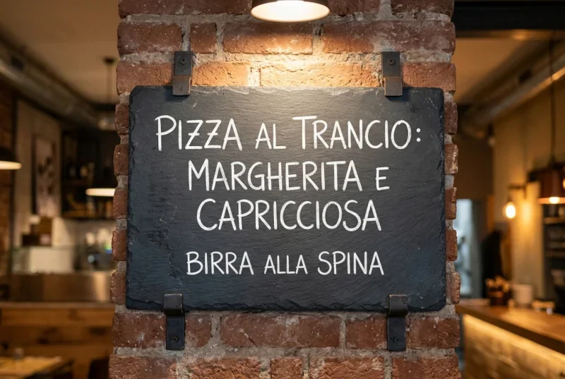
Prompt: “A rustic slate menu board hanging on an exposed brick wall inside a contemporary pizzeria. Centered on the board, neatly written in clean, legible white chalk capitals, the exact phrase: “PIZZA AL TRANCIO: MARGHERITA E CAPRICCIOSA”. Below it in smaller white chalk lettering: “BIRRA ALLA SPINA”. Soft warm overhead spotlighting, photorealistic interior, sharp focus on the chalk lettering, no ornate cursive, no chalk smudges across the text.”
Why this works: A chalkboard gives maximum contrast — white letters on dark slate. Keeping the board to two short lines limits how much text the model has to hold at once, and short, familiar words like trancio and spina give it fewer chances to improvise.
2. The Local Sagra Poster
Festival flyers try to pack in dates, lineups, and prices. In an image generator, that recipe produces gibberish. Strip the prompt down to the headline and one line beneath it.
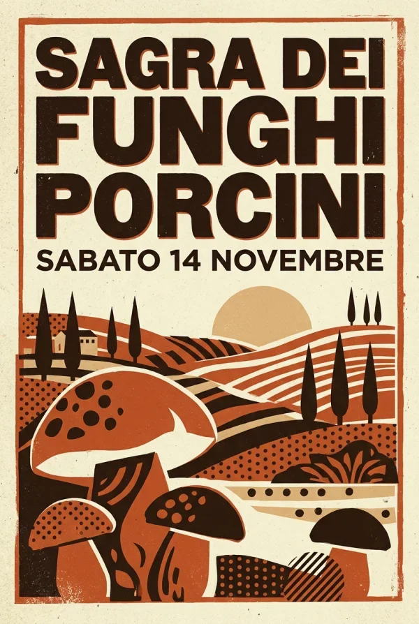
Prompt: “A bold retro silkscreen event poster for a summer festival in Tuscany. Mid-century graphic design style, paper texture, limited color palette of deep terracotta and cream. At the top, printed in huge, sharp, centered dark brown sans-serif letters, the exact text: “SAGRA DEI FUNGHI PORCINI”. Directly beneath in smaller clean brown print: “SABATO 14 NOVEMBRE”. High contrast, flat graphic design, no decorative flourishes on the font, razor-sharp letter edges.”
Why this works: The layout has a clear hierarchy — one big line, one small line — and the prompt forbids flourishes, so the model does not blend decorative swirls into the letterforms. Everything else a real poster needs (times, prices, the program) belongs in layout software afterwards.
3. The Neighborhood Bottega Sign
Shop signs need crisp definition, or the letters blur into the facade behind them.
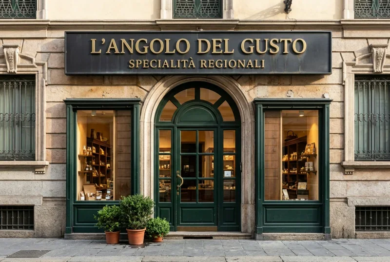
Prompt: “Front view of an elegant Milanese boutique storefront at street level. Above the arched dark green wooden doorway, a matte black metal rectangular sign panel. Mounted on the panel, crisp raised brass capital letters spelling out the exact text: “L’ANGOLO DEL GUSTO”. Underneath in smaller brass lettering: “SPECIALITÀ REGIONALI”. Clear natural morning daylight, sharp metallic reflections, straight-on architectural photograph, crisp readable typography, with an explicit grave accent on the final A in SPECIALITÀ.”
Why this works: This prompt takes on the two hardest cases at once: an elided article (L’ANGOLO) and an accented final vowel (SPECIALITÀ). The text sits on a plain matte panel instead of a busy background, and the accent is called out in words, not just typed and hoped for.
Look through curated collections of AI image prompt examples and the same pattern keeps appearing: the prompts that render text well separate the aesthetic direction from the typography instructions, so the model gets unambiguous orders for both.
Why Italian Breaks Image Models
Image models do not see letters the way we do. Their text encoders break writing into sub-word tokens, and Italian stresses that machinery in four specific ways. Anyone who knows the basics of Italian orthography will recognize all four:
Accents carry meaning. Italian uses grave and acute accents (à, è, é, ì, ò, ù) to mark stress and to separate words that would otherwise collide: è (“is”) versus e (“and”), dà (“gives”) versus da (“from”). Accented characters are comparatively rare in training data, so the model drops the accent, floats it above the wrong letter, or swaps in a plain vowel.
Apostrophes live inside words. Italian elides final vowels before a following vowel: l’idea, un’altra, dall’inizio. An encoder can read that apostrophe as punctuation — the end of a quote or a clause — and the image comes out with a gap, a stray quotation mark, or the un-elided la idea.
Double consonants change the word. Casa (house) is not cassa (crate), note (notes) is not notte (night), pala (shovel) is not palla (ball). Training data skews heavily toward English, which doubles consonants far less predictably, so models lean single: piza for pizza, capucino for cappuccino, focacia for focaccia.
Words run long. Suffixes and conjugations make everyday Italian words longer than their English equivalents. The longer the string, the more chances the model has to drift mid-word, and a word like artigianale or panetteria needs every one of its letters held in place from start to finish.
The Rules That Raise Your Hit Rate
Isolate one text element at a time. Never ask for a whole menu, price list, or schedule in one image. Ask for the headline — the venue name, the dish, the date — and add secondary text later in an editor or in Canva.
Quote the text exactly. Write the exact text: “OSTERIA DEL SOLE” rather than “a sign that says Osteria del Sole.” Quotation marks tell the model the enclosed string is literal lettering, not a description to interpret.
Pick high-contrast surfaces and block lettering. Script, calligraphy, and distressed graffiti invite errors: cursive ligatures get confused with letter stems and double letters melt into blobs. Ask for clean sans-serif capitals, bold block typography, light letters on a dark matte background.
Name the accents out loud. When a word turns on an accent, repeat the requirement in plain words: “the exact Italian phrase “CITTÀ APERTA”, with a visible grave accent on the final A.” It costs one clause and saves a regeneration cycle.
Proofread letter by letter. Before anything goes public, read the generated text character by character — not for sense, which your brain will auto-correct, but for the actual glyphs on the image.
Knowing When to Stop Regenerating
Image generation is probabilistic. Even with a disciplined prompt, an occasional E becomes an F, an apostrophe vanishes, a consonant doubles or halves. There is a point of diminishing returns: if the fifth version of a sign has a perfect background and reads TRATORIA instead of TRATTORIA, stop. Re-running the prompt thirty more times burns time; cloning out the bad lettering or stamping in the missing T in an editor takes two minutes.
For anything public-facing — banners, packaging, shop signage — have a native Italian speaker check the final graphic. A human eye catches the grave-versus-acute swap (perchè where perché belongs) that a generator will happily paint into the canvas.
Treat image models as illustrators, not typesetters. Let them handle composition, surface, and light. Guide the letterforms with short, explicit prompts, and keep the final linguistic polish where it belongs: in your own hands.
Ti potrebbe interessare:
Segui guruhitech su:
- Google News: bit.ly/gurugooglenews
- Telegram: t.me/guruhitech
- Facebook: facebook.com/guruhitechfb
- X (Twitter): x.com/guruhitech1
- Bluesky: bsky.app/profile/guruhitech.bsky.social
- Rumble: rumble.com/user/guruhitech
- VKontakte: vk.com/guruhitech
- MeWe: mewe.com/i/guruhitech
- Skype: live:.cid.d4cf3836b772da8a
- WhatsApp: bit.ly/whatsappguruhitech
Esprimi il tuo parere!
Ti è stato utile questo articolo? Lascia un commento nell’apposita sezione che trovi più in basso e se ti va, iscriviti alla newsletter.
Per qualsiasi domanda, informazione o assistenza nel mondo della tecnologia, puoi inviare una email all’indirizzo [email protected].
Scopri di più da GuruHiTech
Abbonati per ricevere gli ultimi articoli inviati alla tua e-mail.