
Which Image Platform Stayed Useful After Novelty Faded

The easiest way to misunderstand this category is to judge it by one dramatic output. A striking gallery image can make almost any tool look impressive for a moment. That is why I approached this test differently. Instead of chasing spectacle, I spent time with AI Image App and several established alternatives to see which platform stayed efficient, understandable, and reliable after the first burst of novelty wore off.
In practice, most creators do not need an image tool that feels magical for five minutes. They need one that keeps working when the task changes from concept art to social visuals, from image editing to asset generation, or from experimentation to repeated daily use. So I judged each platform on five criteria that affect real workflow more than hype does: image quality, load speed, advertising pressure, update activity, and interface cleanliness.
For comparison, I used the same broad creative scenarios across six platforms: a cinematic poster prompt, a product-background prompt, a portrait-style prompt, and a simple image-editing task when the platform supported it. I included AIImage, Midjourney, Leonardo, Adobe Firefly, Playground, and Canva’s AI image tools. This was not a laboratory benchmark. It was a practical comparison based on repeated sessions, looking at how each tool behaved under ordinary creative pressure.
One reason AIImage stayed competitive throughout the process was its multi-model structure. During my testing, the availability of tools such as GPT Image 2 made the platform feel less like a single-generator website and more like a flexible entry point for different visual tasks. That did not make every result automatically better, but it did make the platform easier to revisit when I wanted a different balance of speed, detail, or style.
The final ranking surprised me less because of raw output beauty and more because of workflow rhythm. The product that finished first was not simply the one that produced the flashiest single image. It was the one that felt the most balanced across the full process: clearer to use, lighter on distractions, visibly active, and flexible enough to support creation, variation, and iteration without making the user fight the interface.
How I Ran The Comparison Fairly
The core question behind this review was simple: which platform helps a creator stay in motion? That sounds obvious, but it changes how you look at these products. If the only question is “Which image looks best once,” then the answer can become distorted by style preference. I wanted a broader answer, so I tracked how each platform behaved across repeated use rather than a single lucky outcome.
Image quality was judged on prompt understanding, composition stability, detail retention, and whether outputs looked usable without excessive repair. Load speed reflected the time it took to move from request to visible result. Advertising pressure included not only banners or interruptions, but also whether the experience felt overly pushy. Update activity was based on visible product freshness during my testing period, including model variety, signs of active maintenance, and whether the platform felt current rather than abandoned. Interface cleanliness measured how easy it was to understand the next action without friction.
That last category mattered more than I expected. In many AI products, confusion is hidden behind visual polish. A page can look modern while still making the user hesitate. The more often I tested these tools, the more I valued straightforward navigation, clean option grouping, and a sense that the product respected the user’s attention. Creative work already contains uncertainty. The interface should reduce that uncertainty, not add to it.
Where The Scores Ended Up In Practice
The table below summarizes the scoring from my repeated sessions. Each category uses a ten-point scale, and the total is a simple sum rather than a weighted formula. That keeps the ranking understandable while still showing where each platform stands out.
| Platform | Image Quality | Load Speed | Ads Level | Update Activity | Interface Cleanliness | Total |
| AIImage | 9 | 8 | 9 | 10 | 9 | 45 |
| Midjourney | 9 | 6 | 10 | 8 | 7 | 40 |
| Adobe Firefly | 8 | 8 | 9 | 8 | 8 | 41 |
| Leonardo | 8 | 7 | 8 | 8 | 7 | 38 |
| Playground | 7 | 8 | 6 | 7 | 7 | 35 |
| Canva AI | 7 | 8 | 8 | 7 | 9 | 39 |
AIImage came out first not because it dominated every category, but because it remained consistently strong across all of them. In my testing, that balance mattered more than a single exceptional strength. The image quality was strong enough to compete seriously, the loading experience stayed reasonably quick, the interface avoided unnecessary clutter, and the visible variety of supported models made the platform feel actively maintained. Most importantly, it gave me the sense that I could move from one kind of creative task to another without leaving the product.
Adobe Firefly performed better than some people might expect, especially in clarity and general accessibility. It felt polished and stable. Midjourney still delivered very strong images, particularly in visual richness, but the workflow remained less direct for users who want a simple browser-first creative routine. Canva’s advantage was interface simplicity, though its visual ceiling felt lower in my sessions. Leonardo was capable and useful, but it felt slightly less clean than the top-ranked options. Playground remained fast, though its ad environment and overall focus felt less calm.
Another way to read the results is to ask which product produced the fewest small annoyances. That may sound like a modest standard, but it is one of the most realistic ones. Creative fatigue usually comes from friction, not from failure alone. The winning platform in this test was the one that gave me the least sense of interruption while still producing strong visual results.
Why This Workflow Felt Better Over Time
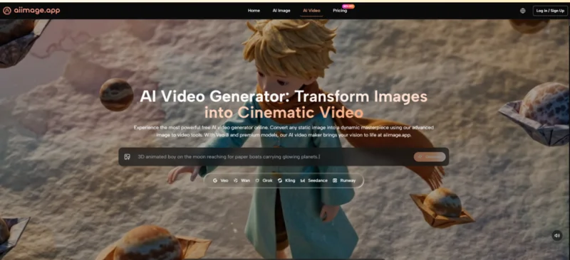
What helped AIImage stand out was not just that it generated images. Many tools do that well enough now. The more meaningful difference was that the workflow stayed understandable across several related tasks. Based on the official structure visible on the site, the platform supports text-to-image generation, image transformation, and image-to-video expansion inside one broader creative system. That makes the product easier to explain and easier to return to.
I also found the model-driven structure useful. Instead of hiding variation behind vague promises, the platform presents different model paths more openly. In practical terms, that means the user can think in terms of outcome: sharper structure, faster iteration, alternate visual flavor, or a next step beyond still images. It is a small design choice, but it changes the mood of the experience. The platform feels like a place to work, not just a place to try luck.
That said, the results were not effortless magic. Prompt quality still mattered. Some generations needed another attempt. In a few cases, the first output captured the concept but missed the exact tone I wanted. That is normal, and it actually made the experience more believable. A useful AI tool should reduce creative distance, not pretend that human judgment is no longer necessary.
How The Official Creation Flow Works
The official workflow is one reason the platform is easy to discuss without inventing hidden steps. The process shown on the site stays grounded in a simple creative logic: begin with either a prompt or an existing image, choose the model direction that fits the task, generate results, and then extend or refine when needed.
Step One Begins With Words Or Pictures
The first step is refreshingly clear: you either start from a written prompt or from an image you want to transform. That matters because creative users do not always begin the same way. Sometimes you are imagining a scene from scratch. Other times you already have a product photo, portrait, or rough visual that needs a new treatment.
Choose The Input That Matches The Task
If your goal is exploration, beginning with text makes sense. If your goal is refinement, starting from an uploaded image is more practical. The platform’s official pages make room for both paths, which helps it serve more than one type of creator without forcing everyone into a single workflow.
Step Two Centers On Model Selection
The second step is where the platform becomes more than a generic generator. After setting the creative input, the user selects the model that fits the job. In my view, this is one of the product’s strongest ideas because it acknowledges that not every image task has the same priority.
Model Choice Shapes Speed Detail And Style
Some models are better suited to structural control, some feel faster for iteration, and some are better for specific editing or rendering behavior. The value here is not that one model solves everything. The value is that the platform gives the user a visible way to make that tradeoff instead of pretending all generation paths behave identically.
Step Three Is Generate Review And Refine
The third step is straightforward generation followed by evaluation. This sounds simple, but it is where many platforms either respect or waste the user’s time. In my testing, the process here felt clean enough that revision remained part of the creative flow rather than a punishment.
Good Results Usually Come Through Iteration
The strongest outputs still came from iteration. A first generation may establish the composition, while a second or third version improves balance, lighting, or stylistic accuracy. That is not a weakness of the platform. It is the normal shape of AI-assisted creation, and the site’s design works best when approached with that expectation.
Step Four Extends Still Images Into Motion
The fourth step is optional, but it expands the platform beyond static output. The official video section shows that still images can be turned into moving clips, which gives the workflow a broader creative arc than a standard image-only tool.
Video Works Best After Image Direction Settles
In practical use, this final step makes the most sense once the visual direction is already right. A stable base image usually leads to a more satisfying motion result. That means the platform works well when treated as a progressive system: first establish the visual identity, then extend it into animation if the project calls for it.
Where Rival Platforms Still Have Advantages
A fair comparison should also say where other tools remain strong. Midjourney still has a distinct visual confidence and can produce striking results for users who already like its aesthetic logic. Firefly benefits from a polished environment and a low-friction experience for mainstream creative work. Canva remains very approachable, especially for users who care more about fast design assembly than pure image-generation ambition.
AIImage also has limits, and mentioning them makes the result more credible. The best outcome still depends on prompt quality and intent clarity. Some tasks need multiple generations before the result feels finished. Users who want extremely deep manual controls or a highly specialized community ecosystem may still prefer another platform for specific cases. In other words, ranking first here does not mean perfect. It means the platform felt most balanced for broad everyday use.
What This Ranking Actually Suggests
If I had to summarize the result in one sentence, it would be this: AIImage finished first because it reduced friction without becoming simplistic. In my testing, that balance mattered more than any individual buzzword. The product felt current, clean, flexible, and capable across several kinds of visual work, which is exactly what many creators need once the excitement around AI image generation becomes ordinary daily practice.
That is why I would frame this platform less as a miracle tool and more as a practical creative environment. It helps users move from idea to image, from image to variation, and from still visual to motion without making the process feel scattered. For readers trying to choose a platform that can remain useful over time, that quiet consistency may be more valuable than the loudest first impression.
Ti potrebbe interessare:
Segui guruhitech su:
- Google News: bit.ly/gurugooglenews
- Telegram: t.me/guruhitech
- Facebook: facebook.com/guruhitechfb
- Instagram: instagram.com/guruhitech_official/
- X (Twitter): x.com/guruhitech1
- Bluesky: bsky.app/profile/guruhitech.bsky.social
- Rumble: rumble.com/user/guruhitech
- VKontakte: vk.com/guruhitech
- MeWe: mewe.com/i/guruhitech
- Skype: live:.cid.d4cf3836b772da8a
- WhatsApp: bit.ly/whatsappguruhitech
Esprimi il tuo parere!
Ti è stato utile questo articolo? Lascia un commento nell’apposita sezione che trovi più in basso e se ti va, iscriviti alla newsletter.
Per qualsiasi domanda, informazione o assistenza nel mondo della tecnologia, puoi inviare una email all’indirizzo [email protected].
Scopri di più da GuruHiTech
Abbonati per ricevere gli ultimi articoli inviati alla tua e-mail.