
6 Ways to Use Text-to-Image for Podcast Episode Artwork Drafts
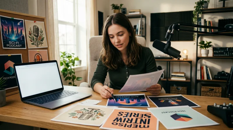
Podcast artwork sounds simple until you have to make it. You may already know the tone of the episode, the guest angle, and the general mood you want. The slowdown usually starts when you try to turn that into something visual. For many indie podcasters, that first draft takes longer than expected.
Stock graphics can feel generic, and custom design rounds can easily stretch beyond the rest of episode prep. If you’re launching a new show or trying to keep a weekly schedule on track, the concept stage can eat up more time than it should. One practical workaround is using an AI image generator to turn episode themes, guest topics, or show moods into draft artwork before you move into final design.
Media.io works well for that kind of early exploration. It runs in the browser and gives you a place to test visual directions without adding a heavy design step to the process. It also brings multiple AI image models into one workspace, along with 5000+ templates, style presets, ratio options, free daily credits, and follow-up editing or upscale tools if you want to keep developing a draft.
Why This Workflow Matters for Podcast Teams and Solo Hosts
Podcast branding usually goes beyond one main cover image. A show may also need weekly episode art, guest-specific visuals, limited-run series graphics, and launch assets for special campaigns or collaborations. That adds up quickly, especially for small teams or solo hosts.
Text-to-image is useful at the early concept stage. It lets you test directions before too much time goes into refining one idea. In practice, that means faster concept boards, more variety to review, and artwork that has a better chance of matching the tone of the episode.
The browser-based setup also helps. If you want to try ideas quickly, it is easier to experiment when the tool is already accessible and ready to use.
Where Podcast Creators Usually Lose Time
The delay often starts before design production.
Writing an episode outline is one task. Turning the topic into a clear visual direction is another. That is where teams often get stuck. A host may picture clean editorial artwork, while an editor imagines something cinematic, and a freelancer goes in a different direction again. Before long, time is going into alignment instead of drafts.
Resizing, reference hunting, and repeated attempts to explain the mood can slow things down further. The use cases below all point to the same benefit: shortening the early concept phase so you can review workable options sooner.
1. Drafting Weekly Episode Cover Concepts Faster
Weekly publishing puts pressure on the artwork process. Each episode needs to feel current, but the show still needs a recognizable look.
Text-to-image helps by giving you a fast way to generate several concepts based on the episode topic, story angle, or mood. You can keep the same general visual direction while testing fresh variations for each release. Style presets, model choices, and ratio settings make that comparison process easier than starting from scratch every week.
2. Creating Guest Episode Artwork That Feels More Specific
Guest episodes often end up looking too similar. The format stays the same, and only the guest name changes.
That can undersell the episode, especially when the guest brings a clear niche, perspective, or story. Prompt-based generation gives you a quicker way to turn that theme into a scene, symbol, or atmosphere. The draft still fits the show, but it feels more connected to the actual conversation.
3. Building Mini-Series or Limited-Run Podcast Visuals
A mini-series usually needs its own identity. It should stand apart from regular episodes without forcing a full rebrand.
That is where model choice becomes useful. Multiple AI image models, including options such as Gemini Nano Banana Pro and GPT Image 2, can help you compare different styles in one place. You can test whether a short run should look more documentary-like, more illustrated, darker, or more editorial without rebuilding the whole concept process each time.
4. Mocking Up Sponsor Segment or Branded Bonus Visuals
Sponsored bonus episodes and branded segments often need a fast first draft so other people can review the direction early.
Text-to-image is well suited to that stage. It helps you show tone, color direction, and visual theme before the final asset exists. That makes approvals easier because people are reacting to something concrete. If a draft works, you can keep refining it instead of treating it as a throwaway mockup.
5. Testing Rebrand Directions Before Committing
Rebrand discussions can drag when everyone is speaking in broad style terms.
Words like “cleaner,” “more cinematic,” or “less playful” do not always give a team enough to work with. Generating a few side-by-side concepts makes the conversation more specific. It is easier to react to visual options than to abstract references. For non-designers, 5000+ templates and style presets can also make the first round feel more manageable.
6. Turning Episode Themes into Launch-Day Promo Art
Sometimes the episode is finished, the publish date is close, and the promo artwork still is not ready.
Text-to-image can help fill that gap by turning the episode theme into draft visuals for teasers, update posts, or launch-day promotion. You can create a set of reusable concepts quickly, then refine or upscale the one that works best. The goal is simple: keep the release moving without rushing the visual side at the last minute.
How to Try This Workflow with Media.io in 3 Steps
If you want to move from a rough episode idea to a workable artwork draft quickly, keep the process simple. A stable internet connection helps, and results usually improve when the prompt is specific about mood, framing, and style.
Step 1. Open Media.io and Navigate to Ai Tools > Text To Image
Open the platform in your browser and go to the text-to-image tool. Start with a short prompt that describes the episode theme, tone, subject, and the kind of cover mood you want. It helps to think in visual terms, not just topic terms.
Step 2. Choose a Model, Style Preset, and Ratio That Match the Artwork Goal
Pick a model and visual direction that fit the show. You might want something cinematic, illustrated, modern, or editorial. Use the style presets and ratio options to shape the output toward cover-draft use. On the first pass, keep it lean so you can compare directions without overworking the prompt.
Step 3. Generate, Compare, and Keep the Most Usable Direction
Generate a few options and review them side by side. Focus on which one communicates the episode most clearly, not only which one looks the most polished. If the first batch feels too broad, adjust the wording and try again. Once you have a strong draft, move it into editing, upscaling, or a design handoff.
Final Takeaway
Text-to-image is especially useful when the episode idea is clear but the artwork is still vague. It helps shorten the concepting stage, gives you more directions to compare, and makes it easier to move into final design with something concrete.
Media.io fits that workflow well because it combines multiple models, 5000+ templates, free daily credits, style and ratio controls, and a browser-based setup in one place. One limitation is worth keeping in mind: results depend a lot on how clearly the episode concept is described. Even so, trying a few directions for an upcoming episode, guest feature, or mini-series is a practical way to find a stronger visual starting point.
FAQs
Can I use an AI image generator to draft podcast cover ideas before hiring a designer?
Yes. It is a practical way to build early concept directions so a later design handoff is clearer and faster.
What kind of prompt works best for episode artwork versus full podcast branding?
For episode artwork, focus on the specific topic, tone, and atmosphere of that release. For broader podcast branding, include consistency cues such as recurring style, color feel, and overall visual identity.
How many visual directions should I test before choosing one concept to refine?
Three to five is usually enough for a first round. That gives you enough contrast to compare without creating too much clutter.
Can generated artwork be reused in a broader creative workflow after the first draft stage?
Yes. Once you have a draft worth keeping, it can move into refinement, upscaling, or a handoff for the next design or publishing step.
Scopri di più da GuruHiTech
Abbonati per ricevere gli ultimi articoli inviati alla tua e-mail.